This website is a piece of history in my website design career. It marked the first proper client project I did, and the first sale over the internet for my website design & development services. It was 2001 and I was about 16.
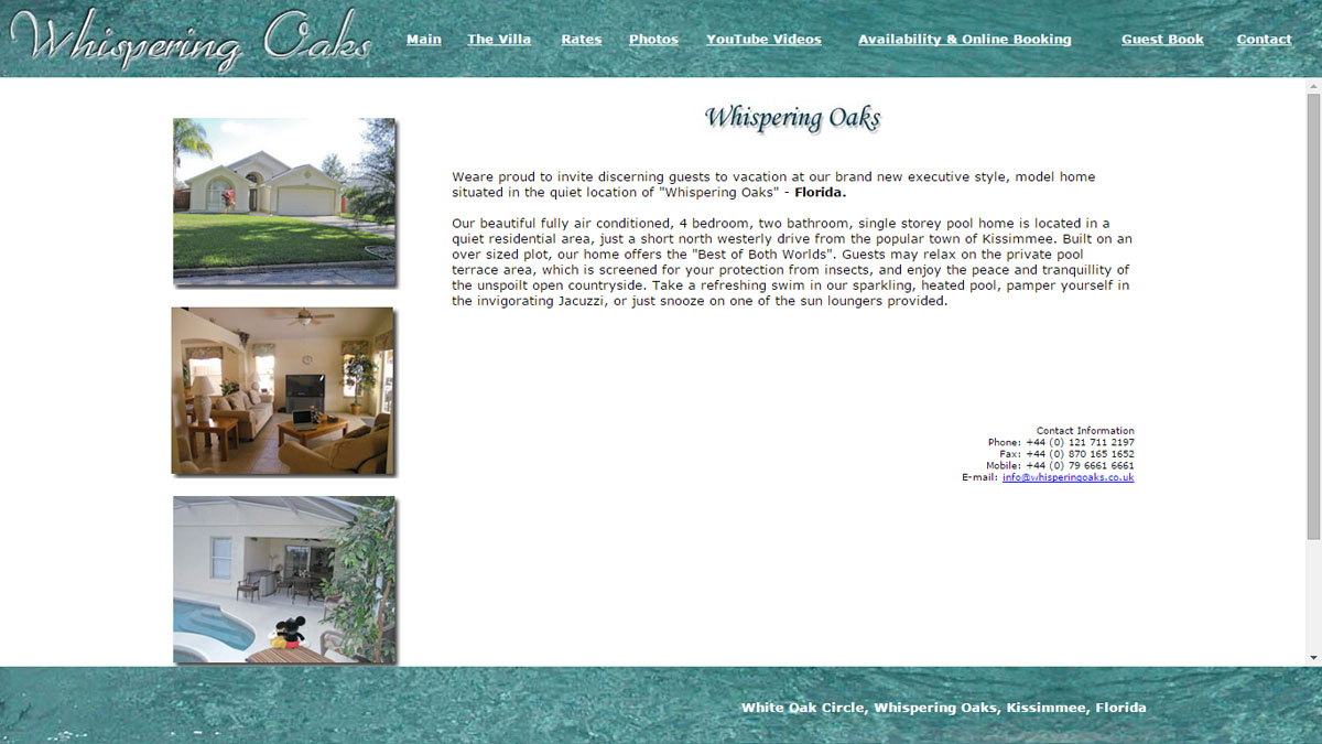
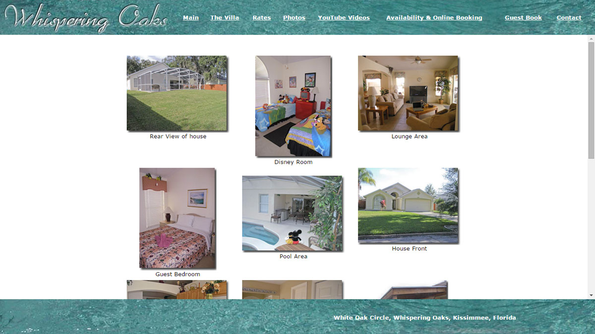
The client was Whispering Oaks, a holiday villa in Florida. I wonder if they still have the Disney bedroom.
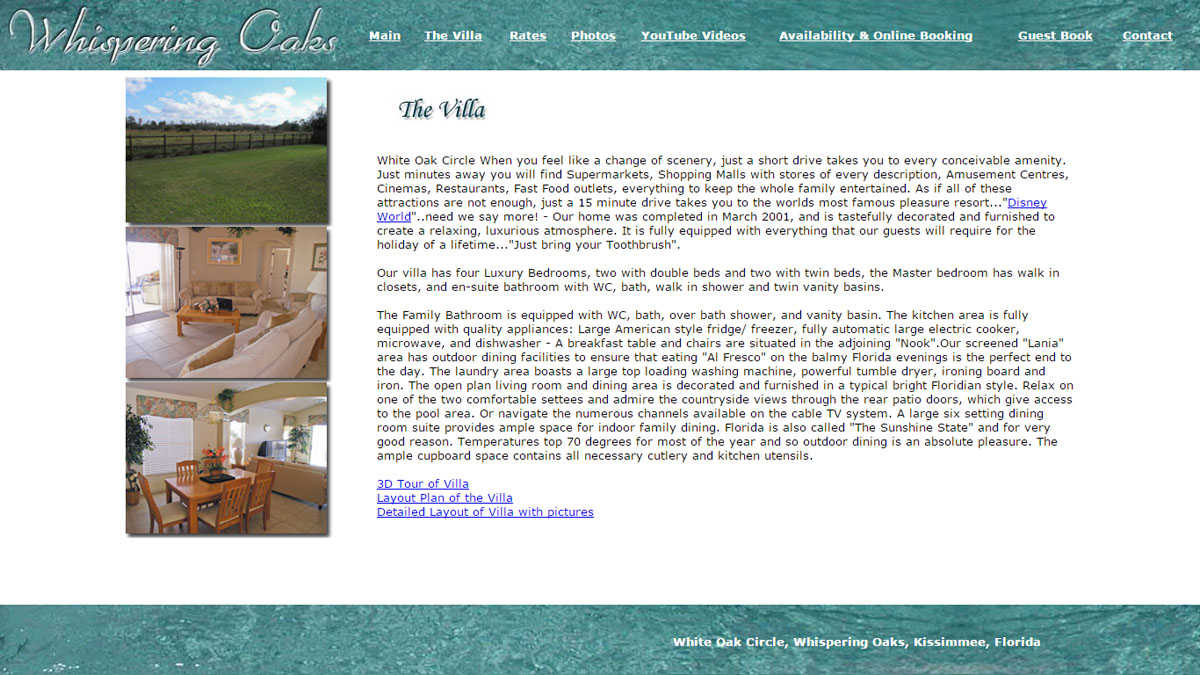
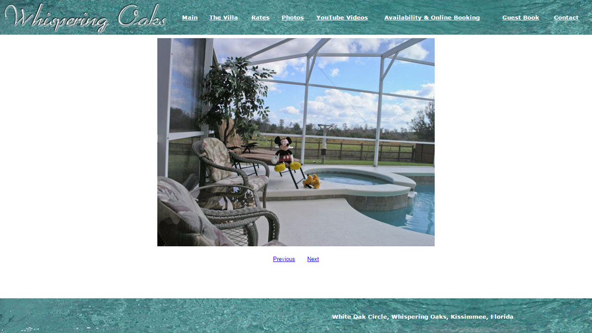
 I was supplied with photos and text content for the site and got started. First creating the layout and the amazingly chiseled logo text in Photoshop. Then after seeking the client’s approval, I sliced up the images and put them back together with hand coded HTML. Using tables for the inner page and fixed top and bottom frames for the navigation layout isn’t something anyone would recreate now, but there were plenty of limitations in a time when IE6 was possibly even considered revolutionary. The layout itself has even aged pretty well, wide and clean with a sidebar in place on some pages. It must have been the frames themselves that everyone turned against, rather than their frequent application as a fixed menu bar – horizontal versions of which are pretty ubiquitous on modern templates, such as this site.
I got the project through an online gaming acquaintance who must have shared my enjoyment of lag and packet loss. I first got started learning and building websites a few years prior to this, creating sites for gaming teams in the UK. The first PHP/MySQL based application I worked on was a match results system which generated player stats and stored screenshots and demos for replays. Good wholesome fun.
The Whispering Oaks website itself is still online 15 years later in 2016, I hope it remains up for a good while longer. You can have a look into the time capsule at: whisperingoaks.co.uk. I believe I quoted and was paid £350 for the website that started my website design career, via a cheque through the Royal Mail. Later I did a further branding and website project for the clients IT business, who also still use the logo design with blue dots and a swoosh that I made in Photoshop 15 years ago. I would probably ditch the swoosh now, but maybe keep the dots as a brand element..


No Comments